
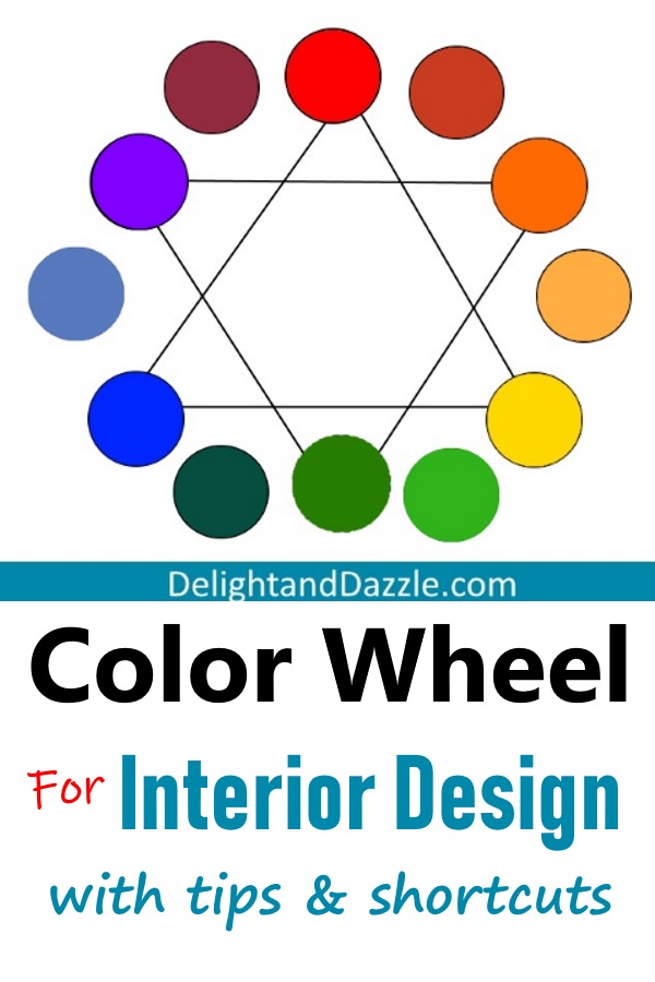
The Color Wheel Explained In Relation To Interior Design
Here is the color wheel explained, in relation to interior design. Just like math, colors naturally combine, blend or contrast in a scientific way. They behave dependably in their relationship to each other. You can use them like formulas. They convey different moods and feelings.
A general understanding of the color wheel will help when you are putting colors together anywhere in your home. It will help you answer important questions. You will also avoid pitfalls such as the wrong cream or gray color for your walls when you pair it with the other colors in your decor.
As I explain the color wheel, how it works and the different terms, I give examples of using them in interior design. I’ll also point out helpful strategies and tips. Along with that I’ve compiled great photos that show color scheme examples. Then, after all that, at the very end, I give you some short-cuts. So read on!
The Colors That Make Up The Color Wheel
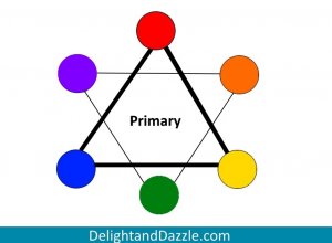
Primary Colors
Primary colors are Red, Yellow, and Blue. These three colors are parent colors. Mixed together they make up every other color but you cannot create them by mixing other colors together. They are the primary, or root, colors.
Secondary Colors
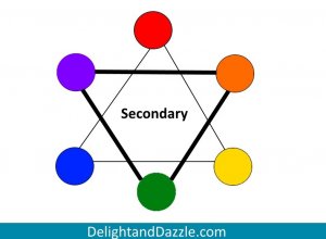
These are the three colors that come from mixing the primary colors together.
Red + Yellow = Orange
Red + Blue = Violet (Purple)
Yellow + Blue = Green
Intermediate, Or Tertiary Colors
These colors come from mixing an equal amount of primary color with an equal amount of one of its nearest secondary colors- the added 6 circles that sit between the primary and secondary colors that I’ve now added.
Red-Orange, Yellow-Orange, Yellow-Green, Blue-Green, Blue-Violet, Red-Violet.
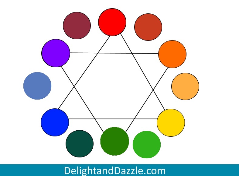
12-Color Color Wheel
Note that the colors I chose are not necessarily the exact intermediate color of equal parts mixed but close enough to enable understanding. A gradient of the color is a different ratio of primary color with secondary color, whether you have more yellow or orange in your yellow-orange. A bigger color wheel may give you more colors with varying gradients in between with potentially hundreds of colors. Although basic, this 12-color wheel is sufficient to teach colors and how they relate.
While picking out a color is a little more complex than simply saying, “that looks red-orange”, the general idea and understanding will help you make good color decisions. No matter the shade or tone, which I define later, the opposite color is always its complementary.
Color Combinations And How They Work, Interior Design
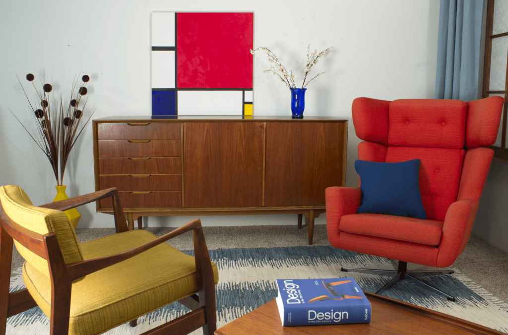
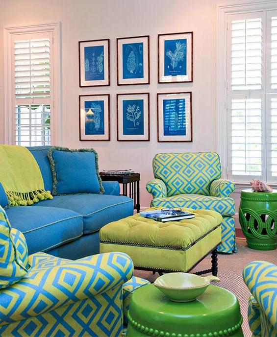
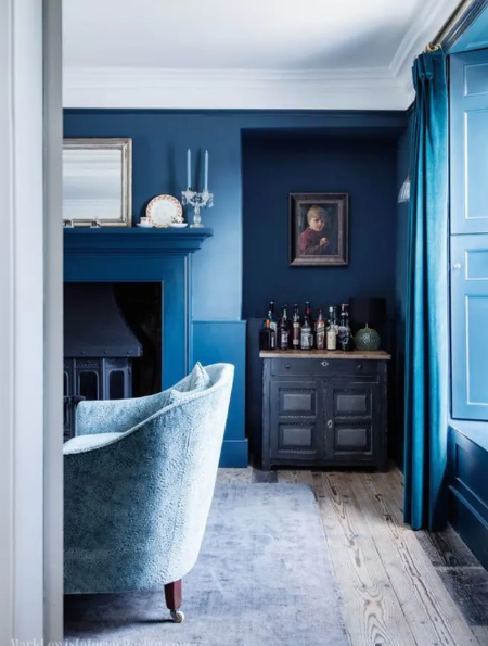
Complementary Colors
Two colors that sit opposite on the color wheel. It’s neat to think about it in terms of how the colors relate to each other. If you take a primary color, yellow, you find it’s complementary color by mixing the other two primary colors together (mixing blue and red give you purple; yellow and purple are complementary to each other).
This means that one of the colors will be cool while it’s complementary color will be warm. It creates contrast! Because complementary colors are the highest contrast you can find on a color wheel, together they each appear brighter and they grab your attention.
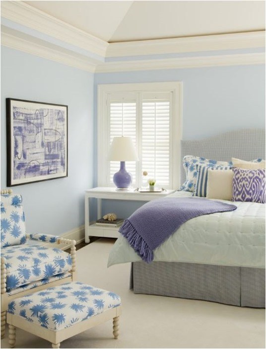
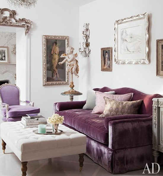
Analogous Colors
These are the colors that sit next to each other on the color wheel. They create harmony with each other. They give balance and serenity and are commonly found in nature.
You can decorate with two to four or even five analogous colors, however three is still your typical number of colors to decorate in. Even when you use analogous colors together, one of the colors should be more dominant, or used more often, in your decorating while the other two colors support it. The 60-30-10 rule, where you decorate 60% with your dominant color 30% with your second or “supporting” color and 10% with the third color for a nice accent, helps create a cohesive look.
When using analogous colors, it’s best to have enough contrast between the colors so that you can identify the colors from each other. For example, if you have blue, blue-green, and green colors, your blue-green mix should be a fairly even mix of the two for a balanced look. If your middle color is too blue or too green, it will throw off the balance.
Analogous colors are peaceful, harmonial, tranquil, even when you use all warm colors together (which you should avoid using warm and cool colors together in an analogous color scheme unless you are adding an accent somewhere – if you are sticking with three to four colors this mistake is easy to avoid since you aren’t traveling too far around the color wheel).
A Note On Undertones
Before I move on to monochromatic colors, this note fits in with analogous colors but is also true in any color scheme.
It’s important to find colors, especially with paint but with any color, that have the same undertone. This becomes especially important with whites and creams, greys, browns and beiges, etc. Colors will behave differently when they are matched with other colors because of the color undertone. For instance, say you are decorating an analogous color scheme of blue. You don’t want to paint your walls a neutral cream color that has a red undertone. Hopefully that makes sense!
A good tip here is to visit a paint store and pick out a color swatch. Paint swatches will be categorized by their undertones. Plus, swatches of related colors will have the same undertone color, be it red, blue or yellow. It’s a quick cheat to make sure you get it right. You can carry those swatches around with you as you choose out fabrics, tile. etc.
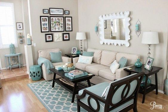
Monochromatic Colors
This is a setting where you only use one color. That color can have different shades, tints or tones to create contrast, but it will still be the same color, or hue. A room can make quite a statement when you have many objects and features in one color, but the more you add neutral colors (still monochromatic because you have one true color) it will be less overwhelming and drastic. It can result in a sophisticated look.
On the reverse side, you may also see a room or home decorated in neutral colors with one color accented throughout. A popular trend I’ve seen in recent years is white or very light interiors with pops of turquoise. That is also monochromatic.
The Other Colors
Neutral Colors
These colors are not on the color wheel. They include black, white, gray, brown, beige and other earth tones. Black is the combination of all colors. White is the absence of color. Brown is a neutral color because it is a mixture of complementary colors where neither color is dominant. But understand that brown can also have an undertone!
Tints, Shades, And Gradients Defined
A tint is when white is added to the color. A shade is when black is added to a color to make it darker. For example, pink is a tint of red and light blue is a tint of blue. Maroon is a shade of red and navy is a shade of blue. A tone comes from mixing a color with grey (or by both shading and tinting a color).
A hue is the pure pigment, or color, of the primary and secondary colors. A gradient, or gradation, of a hue is the varying mix of the hue in the color.
Warm and Cool Colors
Warm colors are those made with red, orange, or yellow. Cool colors are those made with blue, green, or purple.
Warm and cool colors produce different moods. Cool colors help make a space feel relaxing and the warm colors are often energetic. It can also help a room feel warmer or cooler. They can make a room feel cozy, intimate, luxurious or fun. Think about the feeling you want a room to give before deciding on a color scheme.
Applying Color Wheel Interior Design
Using the basic color wheel can be helpful in figuring out what colors will look well together. If you work with it frequently and develop a deep understanding of it, choosing out color schemes can become easy. Here is a tool for using a color wheel and finding color combinations.
But for the beginner or for someone who doesn’t use it often, it may not appear so simple. You see a room decorated in light blue and pink, or deep hues like navy and coral. Those look great together but not ideas you get from looking at a simple color-wheel. Bigger color wheels will includes more gradients and some even include shades and tints. By then it can really seem overwhelming.
So, I’m going to give you some shortcuts below that will aid you in building color schemes. But before we get into that, the color Wheel is still very useful. It will help you answer different questions that you should be asking before you start on decorating. And don’t forget any of the other tips we’ve already covered, like why an undertone is important.
Questions The Color Wheel Can Help Answer
What mood do you want to have in the room? How do you want to feel? What color do you love best (and what goes well with that color)? Are there other rooms in the home that you want to tie together with a specific color? Are there a lot of windows and will it heat up in the summer? Who will use the room and for what?
Shortcuts For Color Wheel Interior Design
I’ll let you in on a little short-cut. Type “color palette” into Pinterest search (Google search works too if you have to) and you get hundreds of ideas. Have a certain color in mind but not sure what to pair it with? Type in “color palette” and then add your color. Want a visual of more than one specific color together with your eyes to see how it makes you feel? Add two or three colors and see what comes up.
This is a great tip for when you want ideas, need a little extra help, or want to visualize colors together. But remember what I said about neutrals? You still need to make sure you get the right undertone when you actually pick out your paint color, etc.
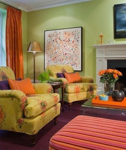
Another way to get ideas or finding a starting point for developing a color scheme is by working backwards. An accessory, an accent wall with wallpaper, or any item in your room that includes all of your colors together can tie your whole room and color scheme together. So, first take something such as a painting or a wallpaper you love and want to incorporate into your room. Then, use those colors from the object/wallpaper/painting/couch pillow (whatever it may be) and use those colors for decorating around.
Read here for more Home Interior Design Basics and pulling all the steps together.
Exceptions And Conclusions
Like I said at the beginning, colors are formulas. They naturally combine, blend or contrast. But in interior design there are always exceptions to the rules and sometimes the answer is, “if it looks good.” Rules in interior design are guidelines that are made to be helpful. If you run into a situation where you want to add an accessory that doesn’t fit the exact plans you laid out in the beginning, it might be okay. Do you like it? That answer can be hard for someone who isn’t confident in a decision. But also remember, don’t be stiff. Be flexible and find the fun in the process. You may come up with something brilliant in the end. After all, it’s what you like.
Leave a Reply